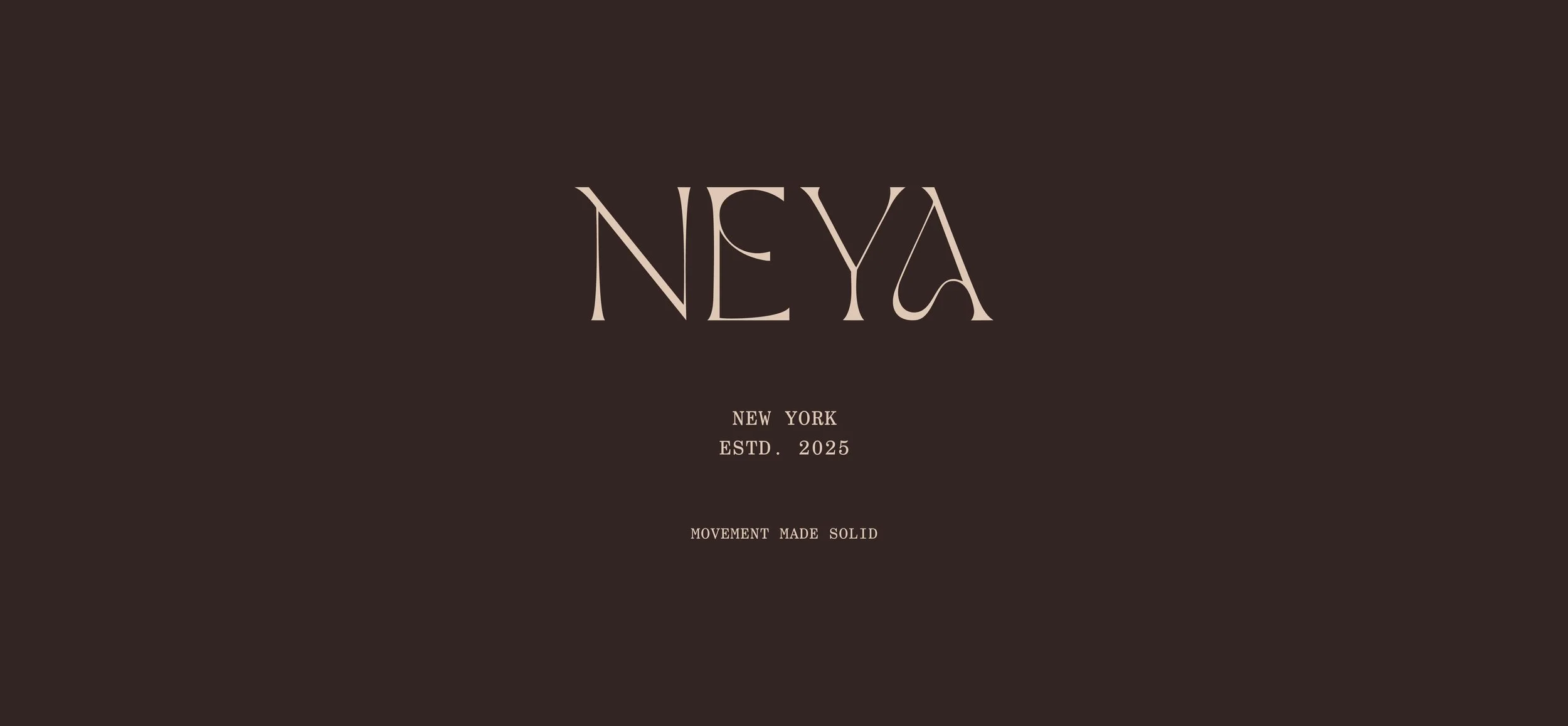
NEYA, New York
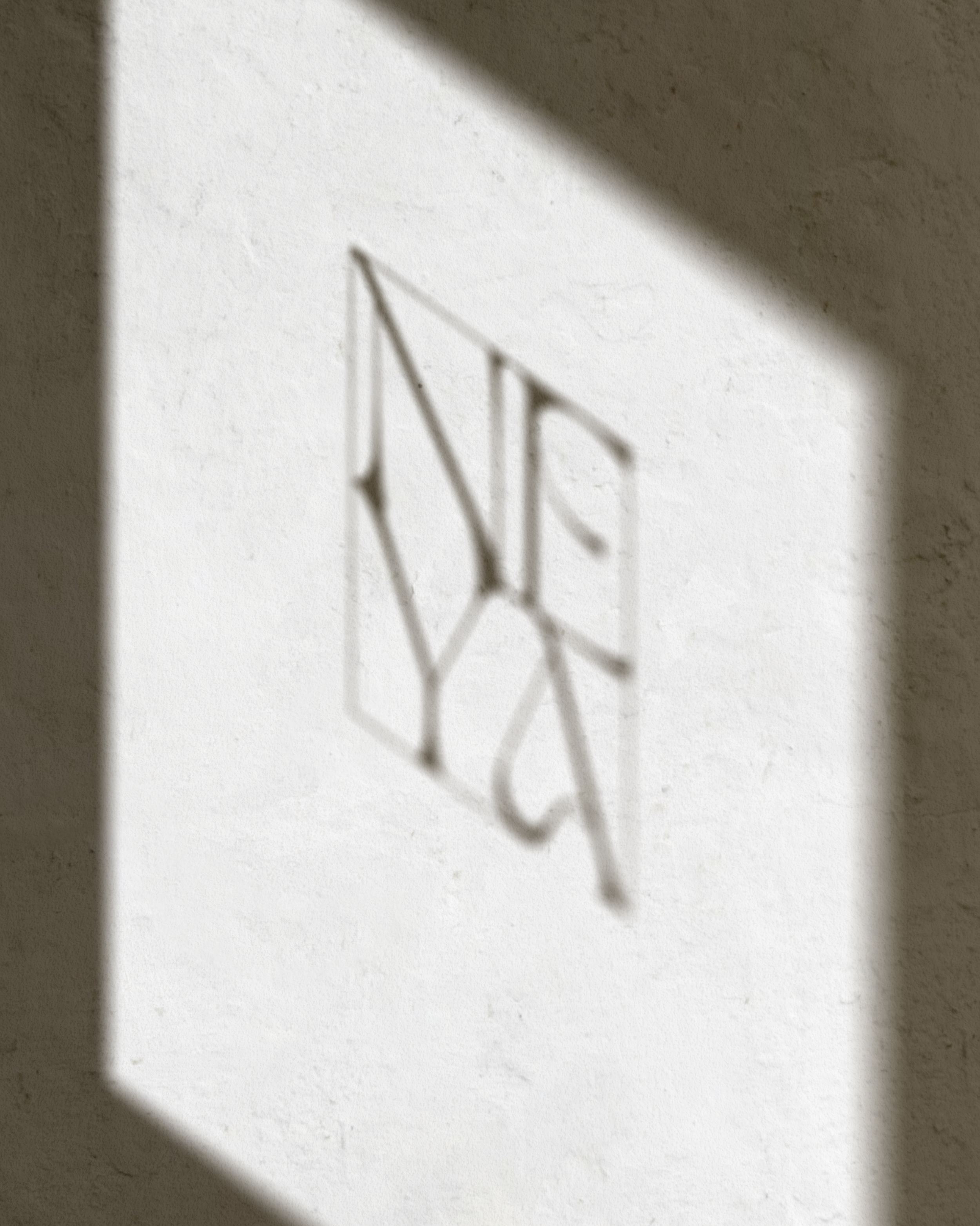
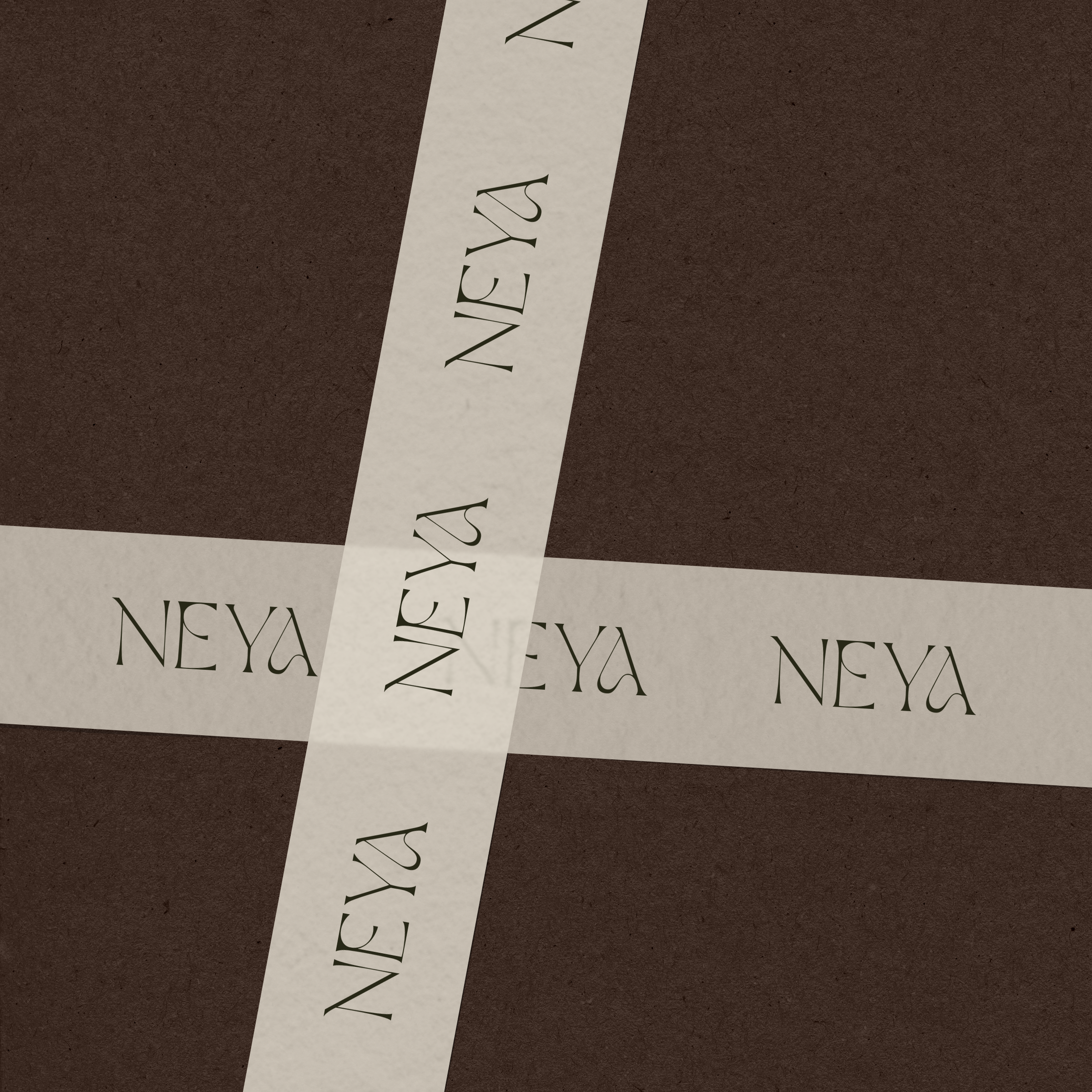
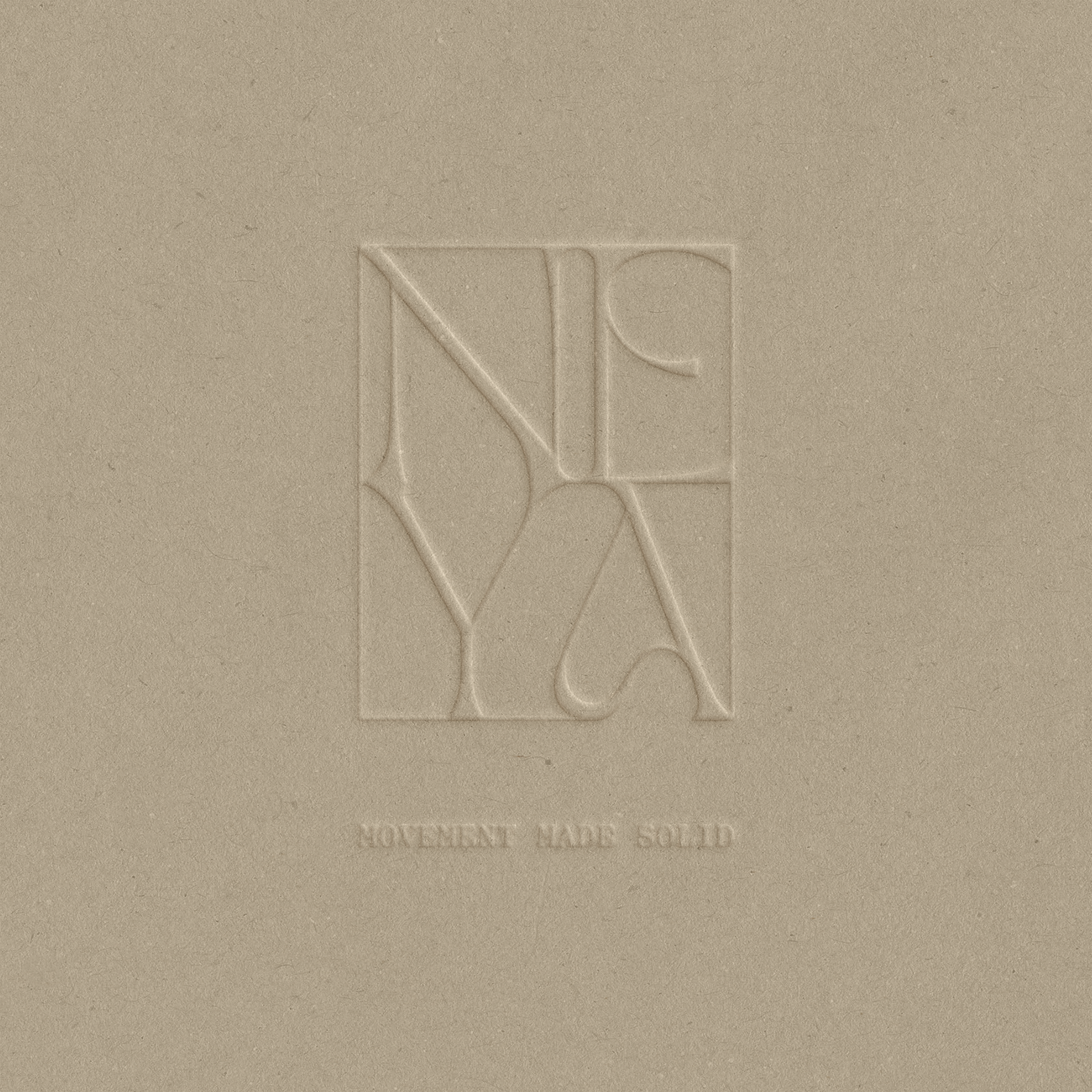
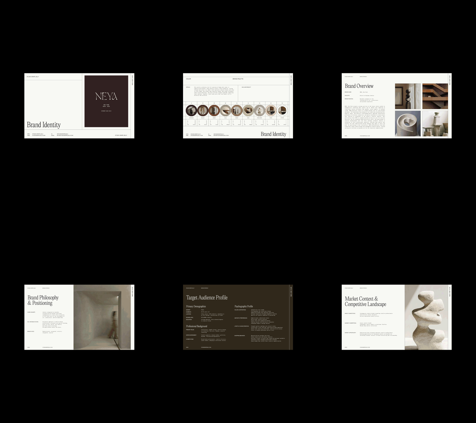
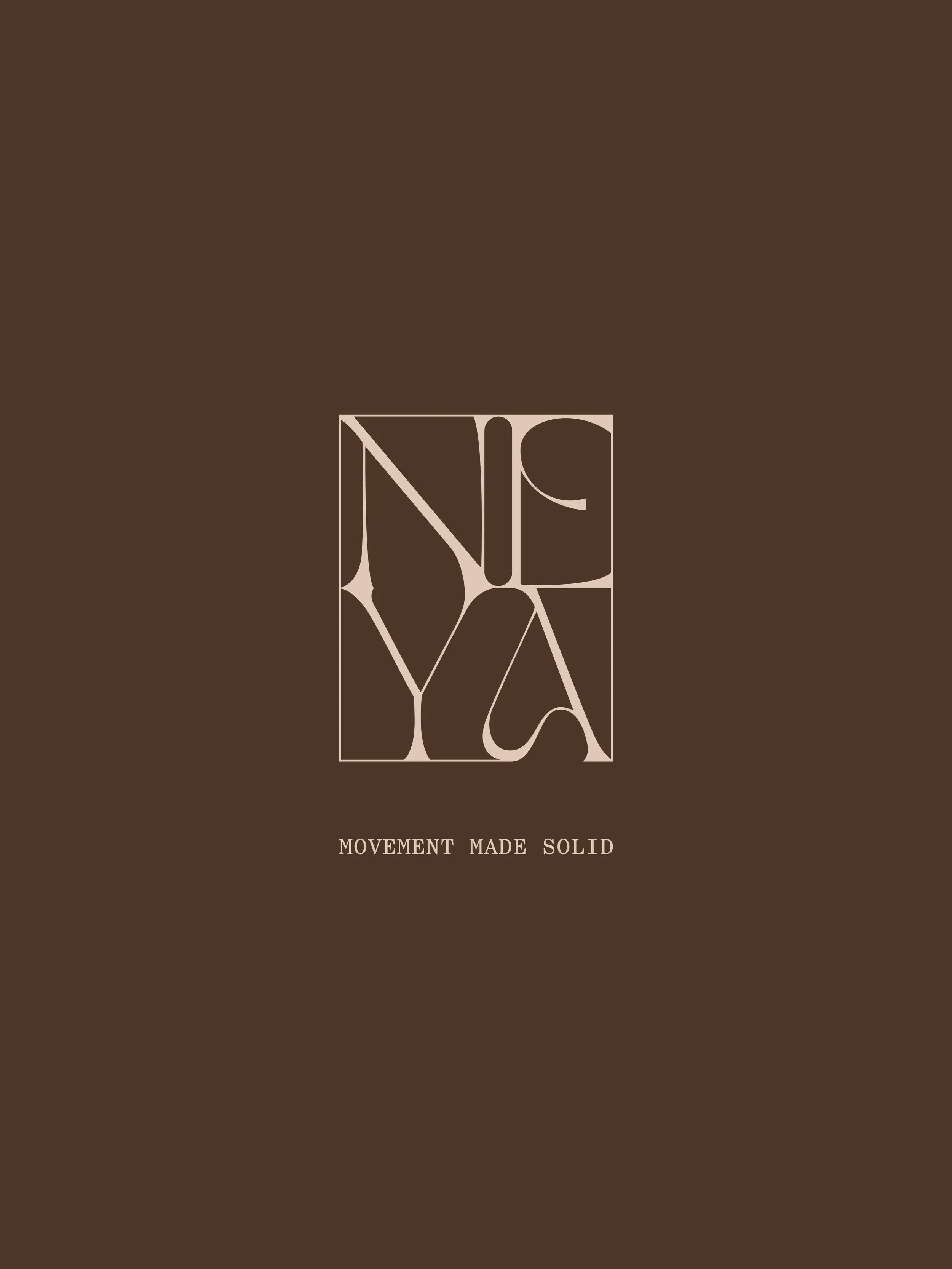
NEYA, New York began with a belief that jewelry could be approached much like architecture: through form, proportion, material, and movement. Founded by architectural designer, Ema Bakalova, the brand imagines each piece as a small-scale structure—something sculptural and intentional, designed not simply to sit on the body, but to exist in relationship with it. We built the brand identity around this intersection of architecture, sculpture, and personal expression, arriving at “movement made solid” as a distillation of NEYA's design philosophy. The visual language follows the same principle: restrained yet expressive, balancing precise typography with organic elements and quiet neutral tones with an abstract emblem that feels like a form suspended mid-motion.
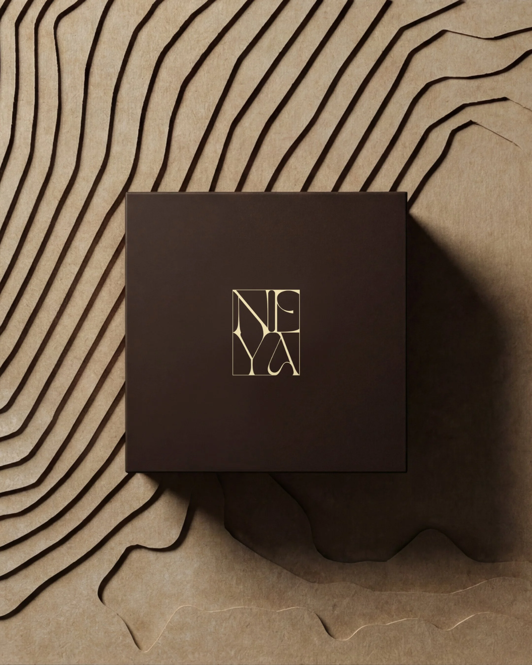
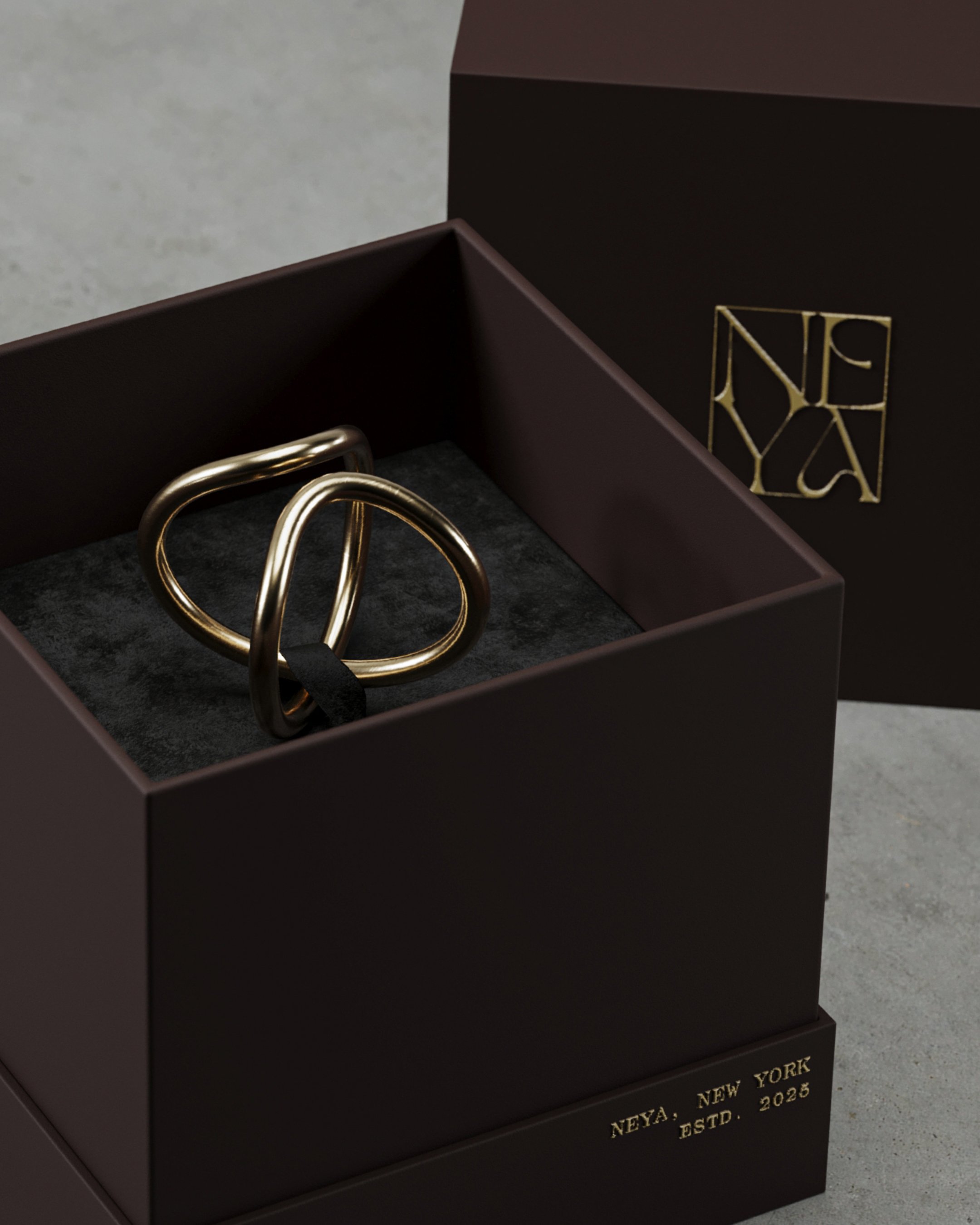
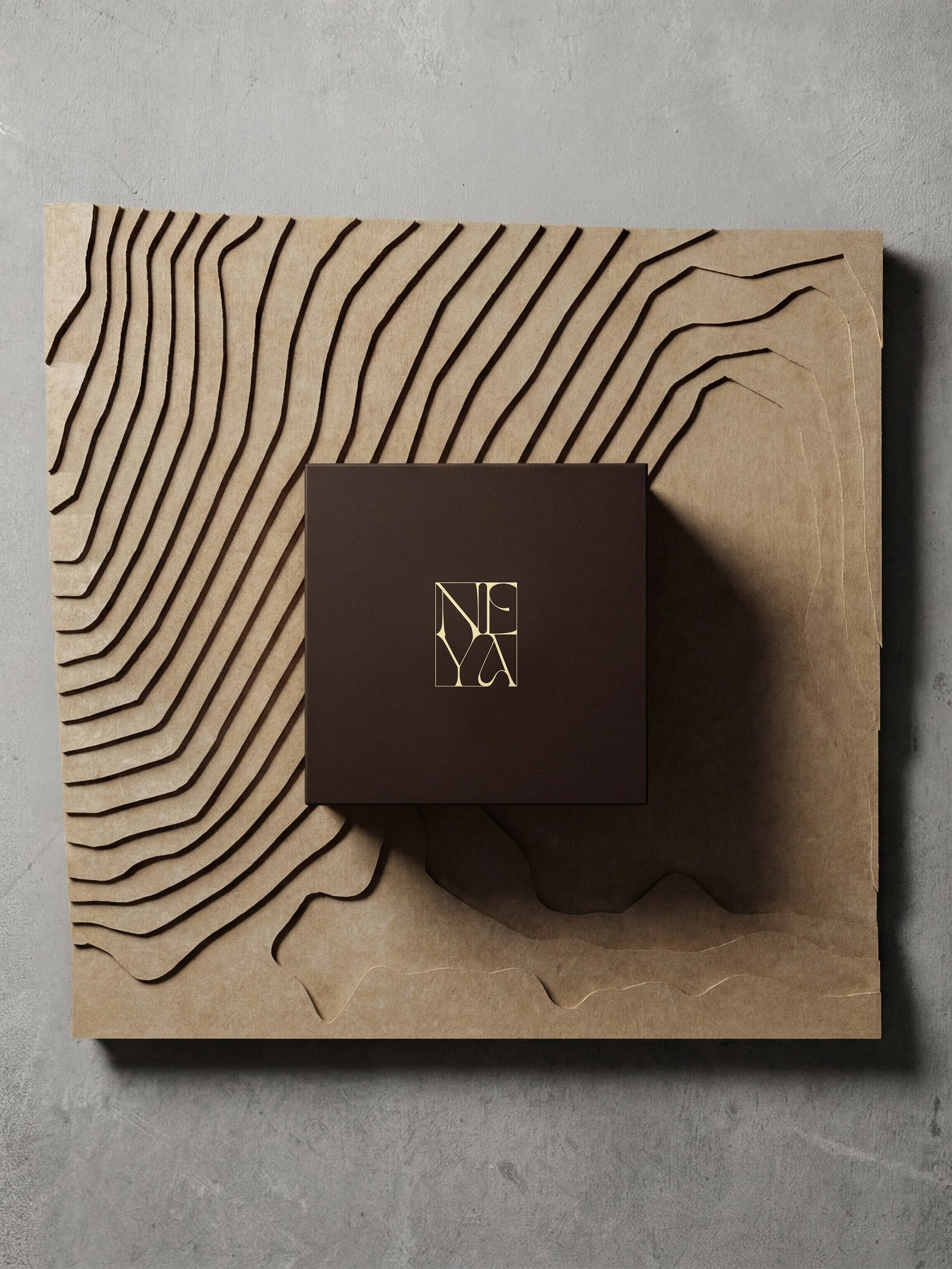
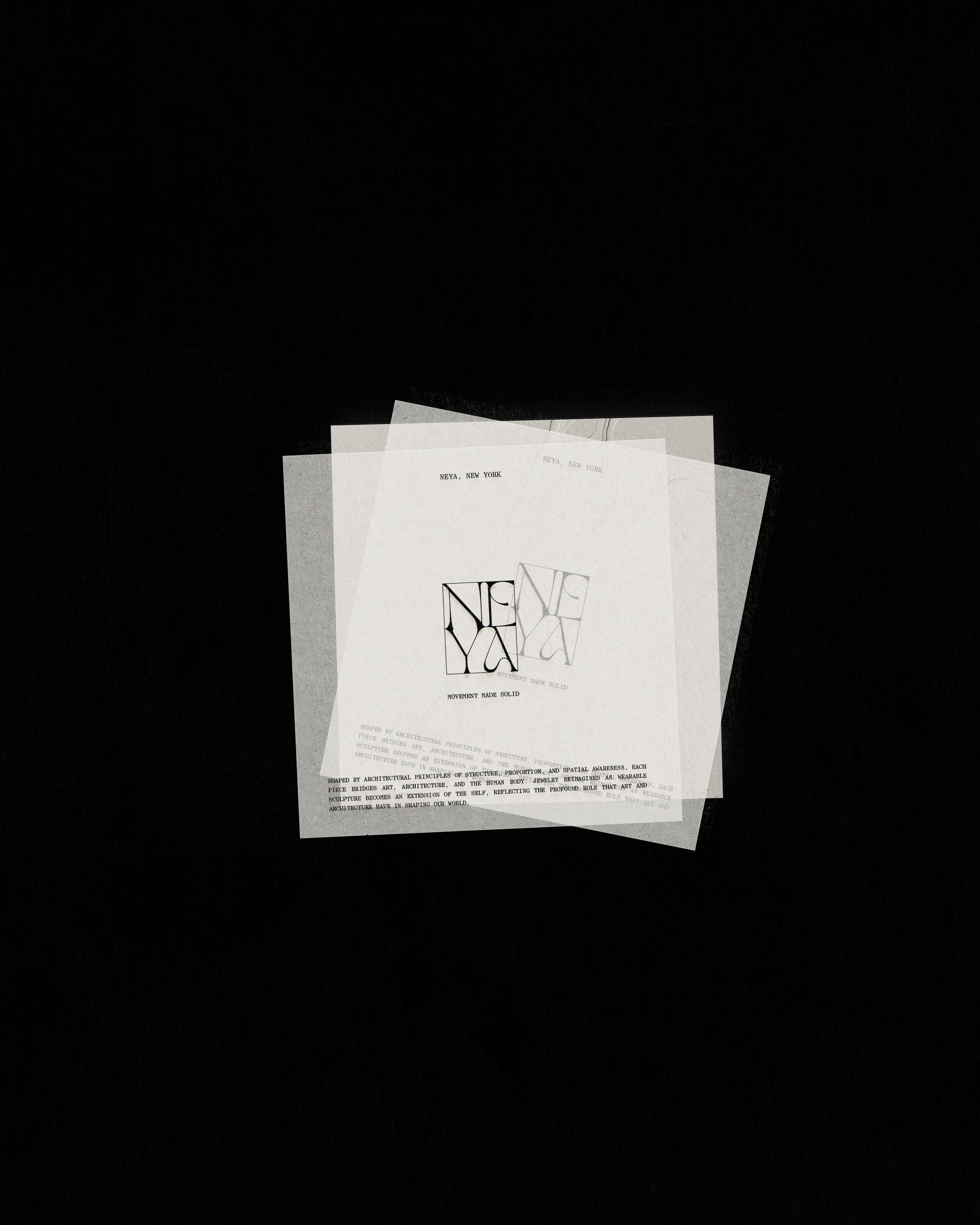
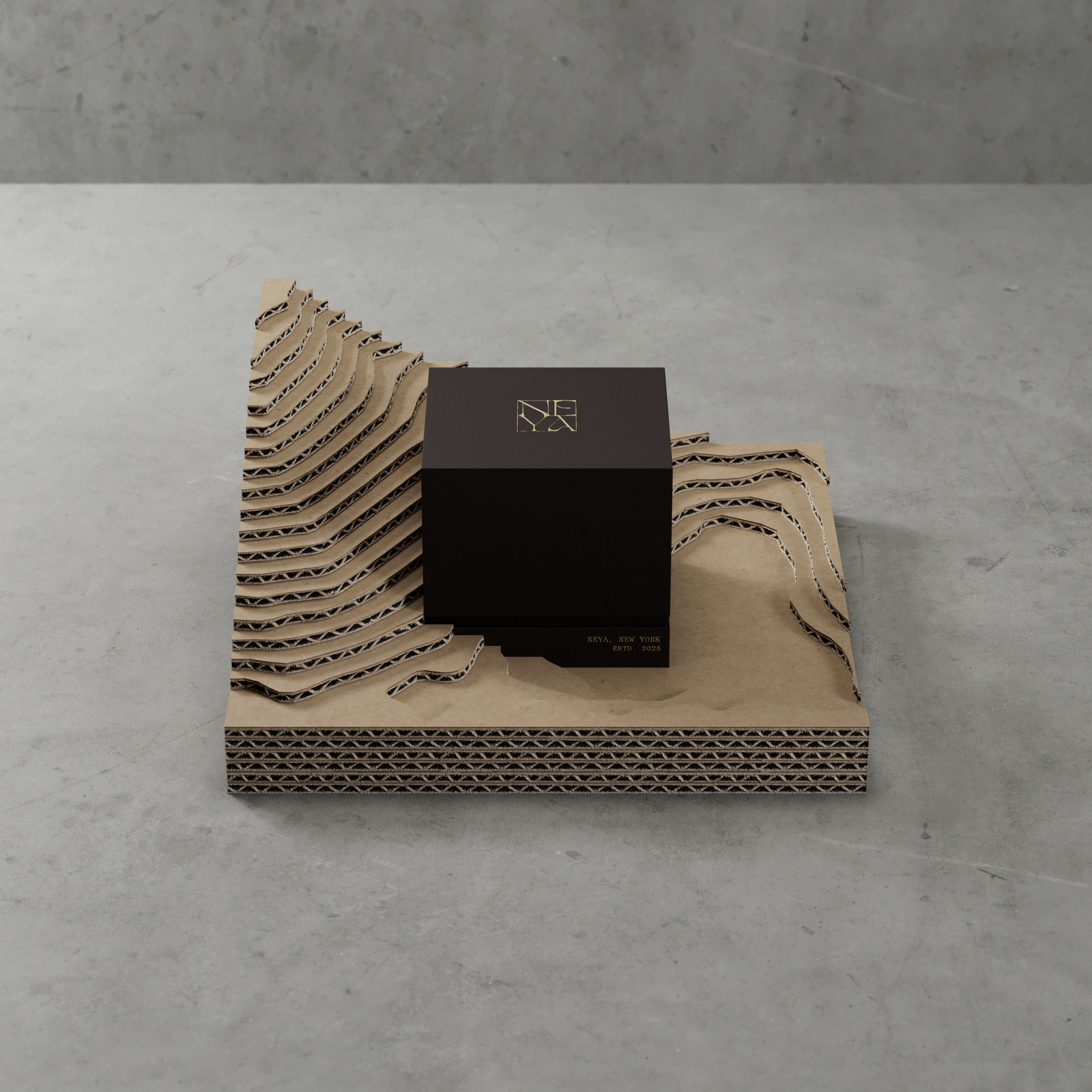
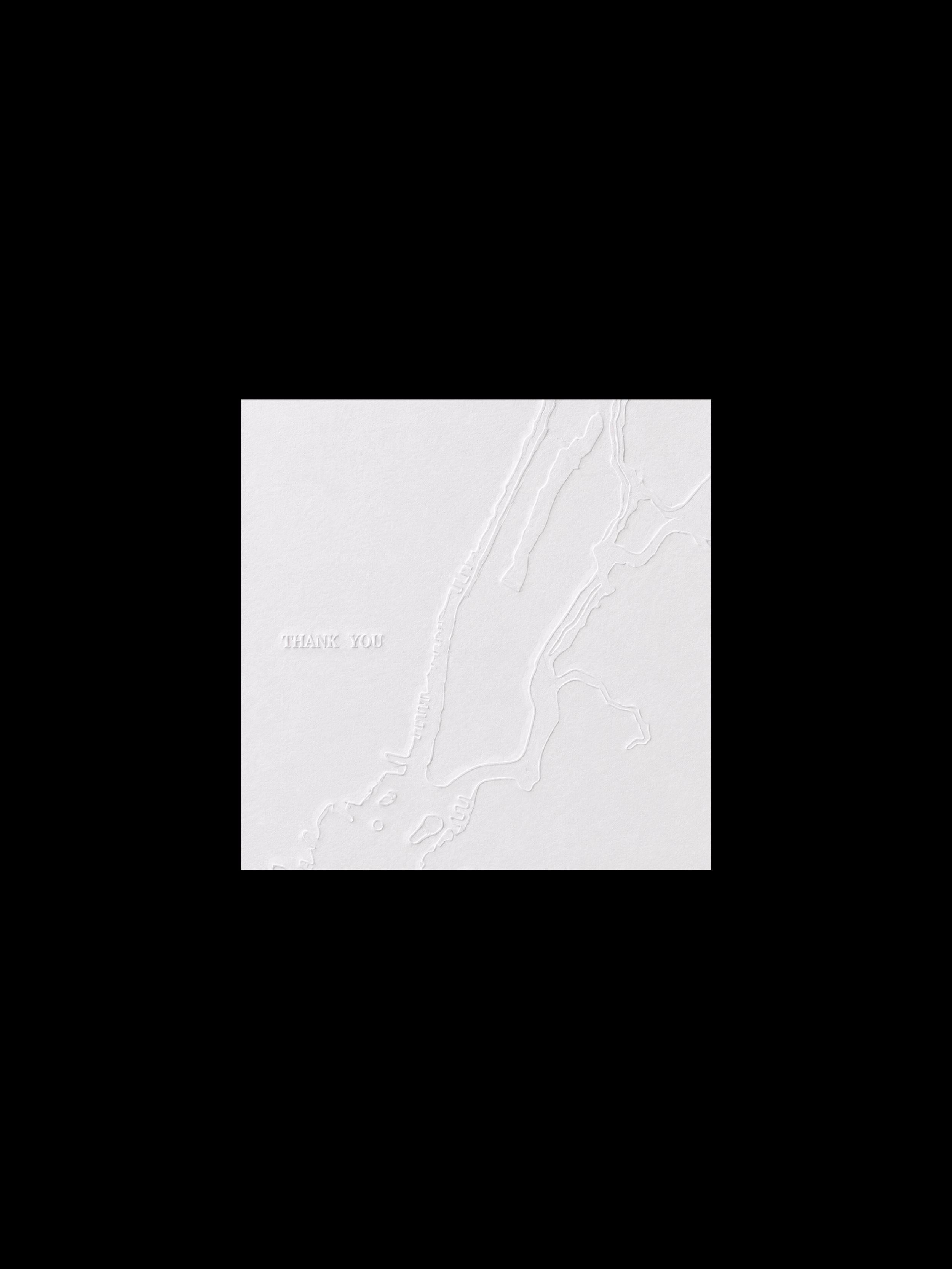
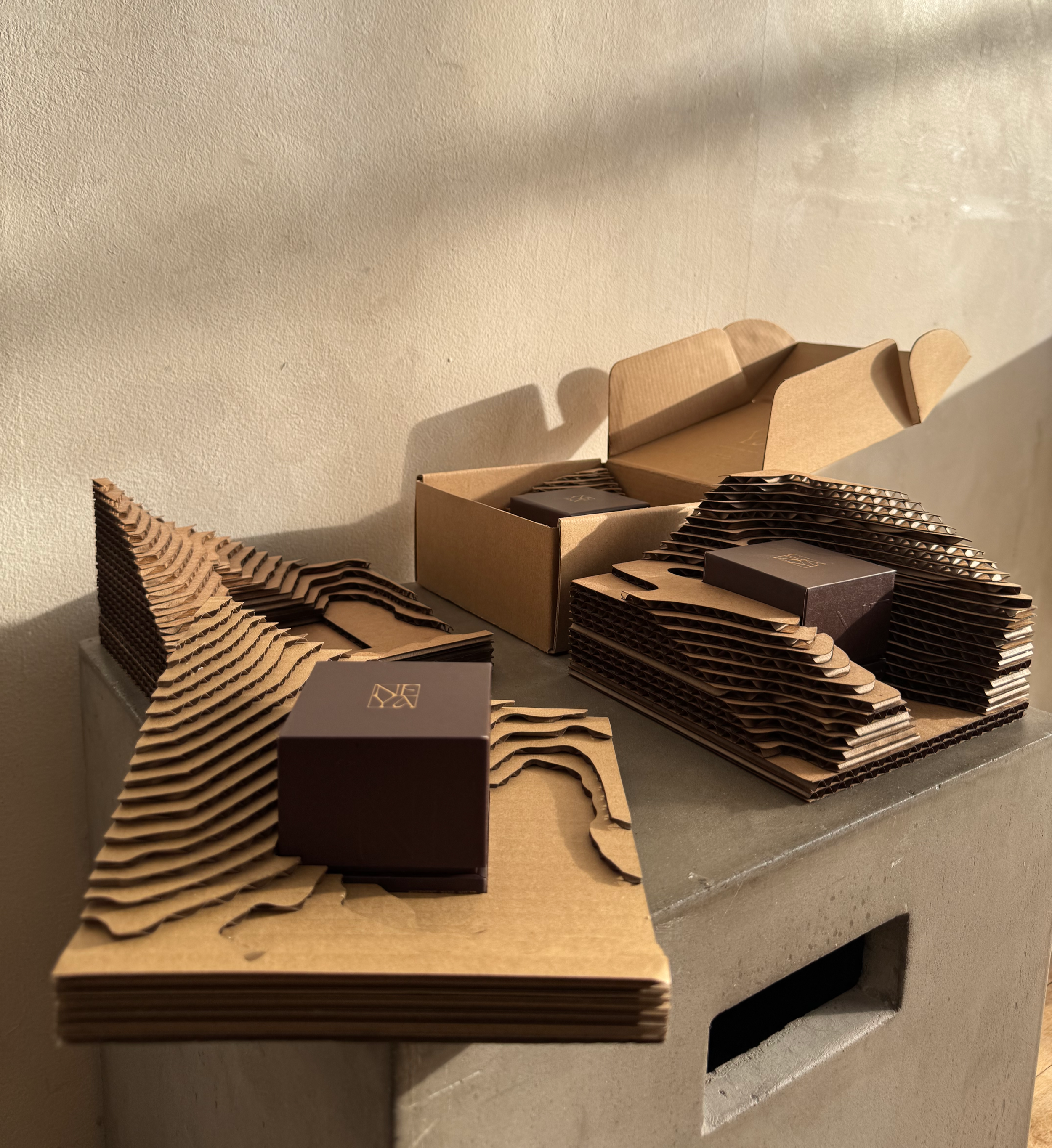
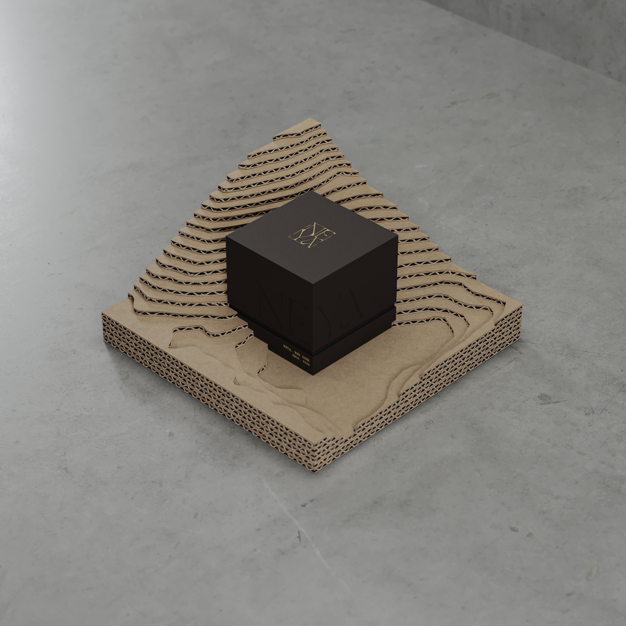
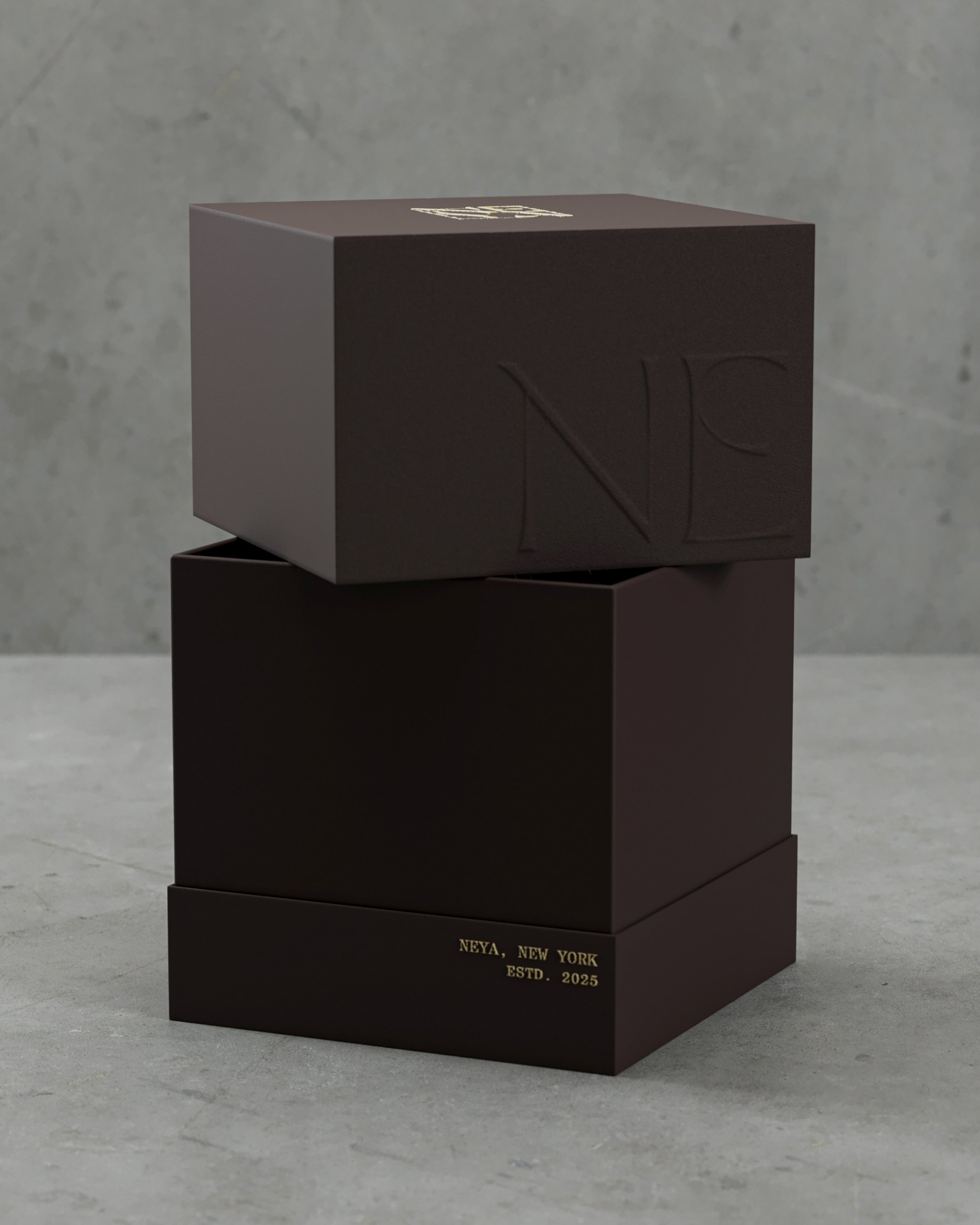
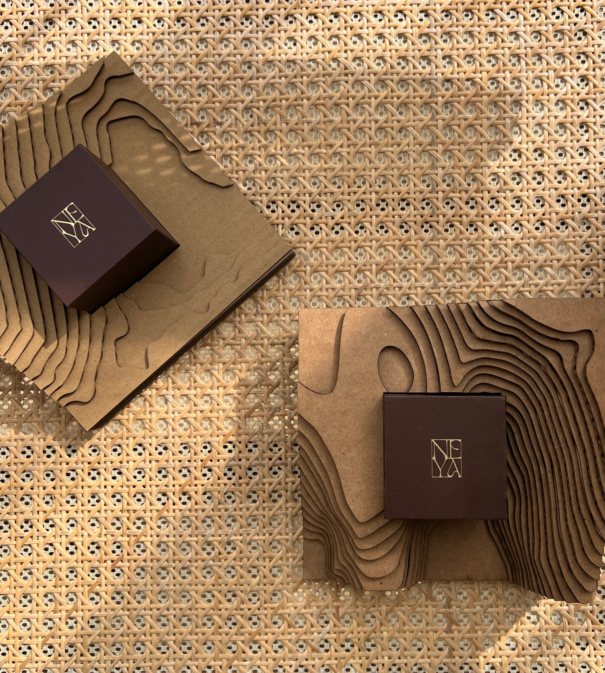
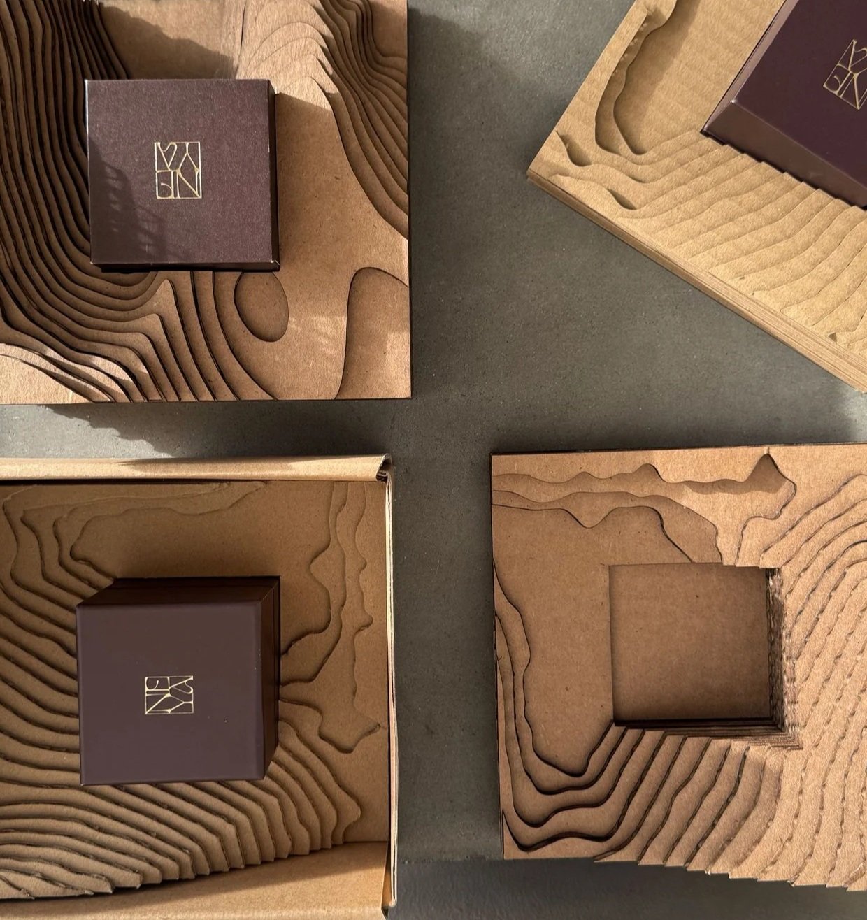
That same philosophy extended into every physical detail of the brand. Rather than treating packaging as a vessel for the jewelry, we approached the unboxing experience as an architectural composition of its own—a sequence of layers, materials, and moments of discovery leading to the piece at its center. Vellum introduces translucency and obscured form, while thick embossed cardstock gives movement a tactile, dimensional presence. An embossed map of New York City offers a quiet sense of place, tracing the brand back to the city where NEYA was founded and its pieces are created. The jewelry box rests within a sculptural corrugated structure inspired by topography, architectural models, and the idea of space being defined through absence. From the exterior packaging to the smallest printed details, each element was designed to unfold slowly and intentionally, transforming the act of receiving a piece of jewelry into an experience of material, movement, and form.
SCOPE
+ Brand Identity
+ Packaging Design
LOCATION
+ New York City, New York